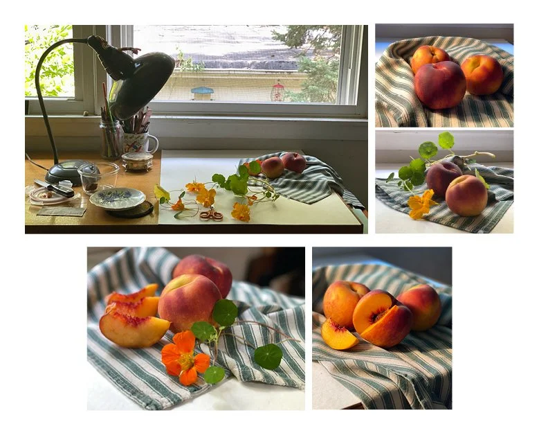
Peachy still life.
Still life set up. Here’s how I start. Using available light from my window and sometimes augmenting that with the table lamp. My props - a kitchen towel, the three peaches, cut one into slices, and nasturtiums. I tried a few different scenes with this combination...but, as much as I like the flowers, it felt complicated and lacked a focal point. Ate the slices. Got another peach. Cut one slice and lost the flowers. This last arrangement feels strong.
Investigation of values. With the help of the Notanizer App. Artist Will Kemp has a post worth reading about working with notans: https://willkempartschool.com/?s=notans
Thumbnail study. A small rendering like this helps me to warm up, and to get an idea in my head of the lay of the land. Note how the wet darker colors in second image dried lighter in the third image. Keep this in mind. It’s one of the ways watercolor works.
Planning the painting. Of course you can jump right in, start a painting. It’s one way to figure things out. And often can result in success. I like to figure out a few things before I start, the colors, the pattern of darks and lights (values). On this page I started out thinking I would use violet for shadows in the peach. Now I’m leaning towards Maroon Perylene or Perm. Alizarin Crimson. I do like the violet in shadows on the towel.
A moment of work in progress. I couldn’t capture the development of the peaches in still photos. Painted them wet in wet. Things happened fast. During the demo I laid in the dark shadows with winsor violet. It surprised me! But here’s a great example of being in the moment, and a bit under pressure. These darks turned out to be my favorite part of this painting.
And look what the students painted. After a bit of grumbling about the striped towel. Which is funny because the stripes give this still life movement. I love the stripes! The ways they were interpreted.


