Painting the sour cherries
Here’s a few photos I took of the sour cherries in my backyard. I’m drawn to the third photo. Probably because of the light. And the strong diagonal of the branch.
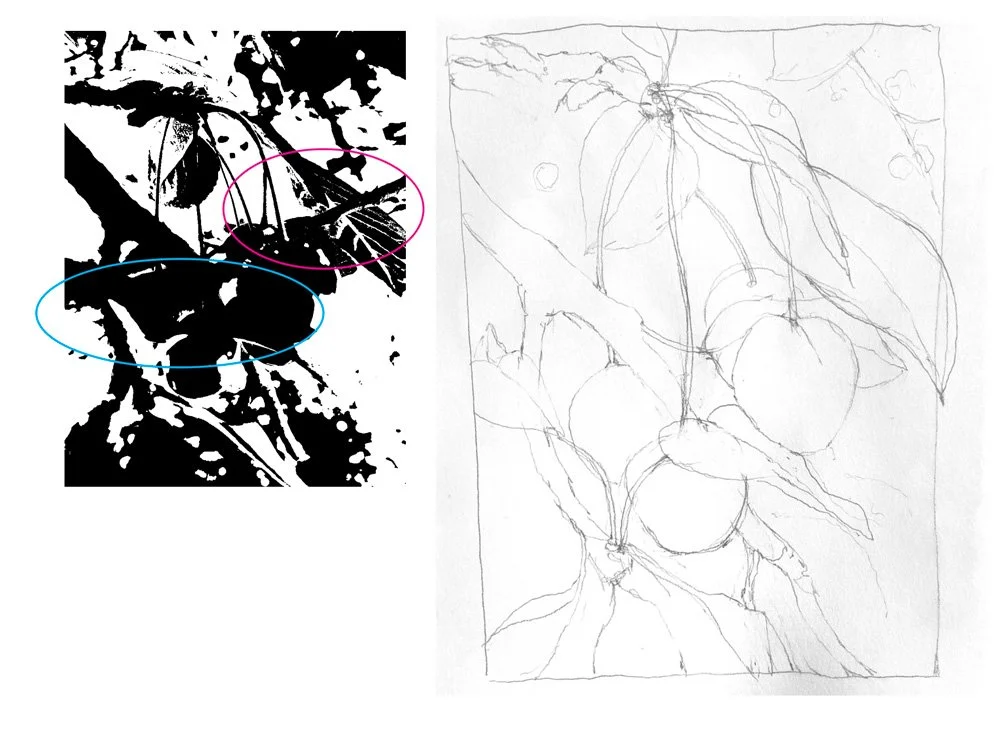
I made a notan with the Notanizer app in order to judge what is happening compositionally with the darks and lights. I’m not liking the diagonal line, circled in red. Also want to clarify the shapes circled in blue.
My drawing shows my changes to the composition. Next step; test some colors.
I started with cadmium red light and found it to be too opaque, and a bit blotchy. It didn’t blend well with the darker maroon perylene. The quinacridone red works better, (see how it’s nice and smooth) but it’s a cool red and I want something warmer. I did use a warm transparent red oxide for the shadow, which helped. Then I googled warm transparent red watercolor and landed on Jane Blundell’s very detailed blog. She says, “Pyrrol Scarlet is my favorite warm red.” I don’t have this color! So if you do, try it. Her blog is worth a visit. https://janeblundellart.com/warm-reds.html
I kept going with my color exploration, different methods for adding shadows. Fooled around with water drops.
My final painting
Selection of the Student's paintings


